Discutii despre tot ce nu se incadreaza in celelalte categorii.
Moderators: Moderatori ajutatori, Moderatori
-
WISHEXEC
- Membru, skill +4

- Posts: 1682
- Joined: 12 Nov 2011, 19:37
- Detinator Steam: Da
- CS Status: AmxModX
- Detinator server CS: DAEVA.RO
- Reputatie: Fost Moderator ajutator
Nume anterior : ONEMDX
- Location: România
- Has thanked: 84 times
- Been thanked: 85 times
-
Contact:
-
-BlacKodE-
- Fost moderator

- Posts: 1193
- Joined: 16 Nov 2013, 11:57
- Detinator Steam: Da
- SteamID: blackode
- Reputatie: Fost Super moderator
Membru Club eXtreamCS (1 luna)
Fost Membru Club eXtreamCS (5 apr - 5 mai - acces in club)
- Has thanked: 16 times
- Been thanked: 10 times
07 Jun 2016, 14:19
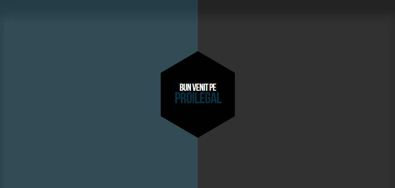
Poftim ti-am facut unul la fel doar din CSS. Nu stiu ce efecte are deoarece m-am luat dupa imagine.
- | Afiseaza codul
<head>

<title>SITE NAME</title>

<style>

body {
  background: #314c54;
  background: -moz-linear-gradient(left, #314c54 50%, #313131 50%);
  background: -webkit-linear-gradient(left, #314c54 50%,#313131 50%);
  background: linear-gradient(to right, #314c54 50%,#313131 50%);
  filter: progid:DXImageTransform.Microsoft.gradient( startColorstr='#314c54', endColorstr='#313131',GradientType=1 );
}

a {
  text-decoration: none;
}

h1 {
  color: #003341;
  text-align: center;
  font-family: Arial;
  font-weight: bold;
  font-size: 40;
  line-height: 0;
}

h1:hover {
  color: #ffffff;
}

h2 {
  color: #ffffff;
  text-align: center;
  font-family: Arial;
  font-weight: bold;
  font-size: 24;
  padding-top: 50px;
}

.hexagon {
  position: relative;
  width: 300px;
  height: 173.21px;
  background-color: #000000;
  margin: 0 auto;
  top: 300;
}

.hexagon:before,
.hexagon:after {
  content: "";
  position: absolute;
  width: 0;
  border-left: 150px solid transparent;
  border-right: 150px solid transparent;
}

.hexagon:before {
  bottom: 100%;
  border-bottom: 86.60px solid #000000;
}

.hexagon:after {
  top: 100%;
  width: 0;
  border-top: 86.60px solid #000000;
}

</style>

</head>

<body>

<div class="hexagon"><h2>BUN VENIT PE</h2><a href="http://site.com"><h1>SITE NAME</h1></a></div>

</body>
EDIT: Am facut un update. Si anume un mic efect de rotatie pe hexagon. Sper sa iti placa.
- | Afiseaza codul
<head>

<title>SITE NAME</title>

<style>

body {
  background: #314c54;
  background: -moz-linear-gradient(left, #314c54 50%, #313131 50%);
  background: -webkit-linear-gradient(left, #314c54 50%,#313131 50%);
  background: linear-gradient(to right, #314c54 50%,#313131 50%);
  filter: progid:DXImageTransform.Microsoft.gradient( startColorstr='#314c54', endColorstr='#313131',GradientType=1 );
}

a {
  text-decoration: none;
}

h1 {
  color: #003341;
  text-align: center;
  font-family: Arial;
  font-weight: bold;
  font-size: 40;
  line-height: 0;
}

h2 {
  color: #ffffff;
  text-align: center;
  font-family: Arial;
  font-weight: bold;
  font-size: 24;
  padding-top: 50px;
}

.hexagon {
  position: relative;
  width: 300px;
  height: 173.21px;
  background-color: #000000;
  margin: 0 auto;
  top: 300;

  -webkit-transition: .3s all ease-out;
  -moz-transition: .3s all ease-out;
  transition: .3s all ease-out;
}

.hexagon:before,
.hexagon:after {
  content: "";
  position: absolute;
  width: 0;
  border-left: 150px solid transparent;
  border-right: 150px solid transparent;
}

.hexagon:before {
  bottom: 100%;
  border-bottom: 86.60px solid #000000;
}

.hexagon:after {
  top: 100%;
  border-top: 86.60px solid #000000;
}

.hexagon:hover {
  background-color: #003341;
  -webkit-transform: rotate(360deg);
  -moz-transform: rotate(360deg);
  -ms-transform: rotate(360deg);
  -o-transform: rotate(360deg);
  transform: rotate(360deg);
}

.hexagon:hover h1{
  color: #000000;
}

.hexagon:hover:before {
  border-bottom: 86.60px solid #003341;
}

.hexagon:hover:after {
  border-top: 86.60px solid #003341;
}

</style>

</head>

<body>

<a href="http://site.com"><div class="hexagon"><h2>BUN VENIT PE</h2><h1>SITE NAME</h1></div></a>

</body>


